


Five Must-know Technical Analysis Tools
In recent years, technical analysis has grown more popular among investors. Part of the increase in popularity comes from the rise of cryptocurrencies. As digital assets, Bitcoins and other cryptocurrencies do not have fundamentals such as P/E ratios or book values for investors to analyze. Instead, investors make trading decisions by graphing and interpreting price and trading volume data, a technique known as technical analysis.
Technical analysis is powerful because it doesn’t require any detailed understanding of the underlying security. Instead, we study the price and trading volume of a security and make price predictions graphically. What technical analysts are trying to capture are the sentiments and trends in the market. Market forces such as trends and momentums affect the price and trading volume of a security. Through technical analysis, these market movers can become visible with accuracy.
In this article, we will go through five of the most important technical analysis concepts and give you a few new tools to improve your trading returns.
Support and resistance
Before we go into fancy technical analysis tools, we must first understand support and resistance levels. These two concepts are instrumental in understanding the potential price range of a security. They are also the foundation of many technical trading strategies.
A support level is the lower price bound for a security. When the price of a security declines and approaches the support, the drop slows down and it is difficult for the price to go below the support level. Consequently, the support level of a security literally “supports” its price and prevents further declines. For example, in the chart below, we can see that for the currency pair GBPUSD, 1.3 was the support. This level was repeatedly tested in late January and early February but never breached.
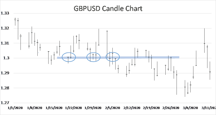 On the other hand, resistance is the upper price limit of a particular security. When the price goes up and approaches the resistance level, the rally will decelerate. Additional momentum would be needed to rise above this level.
You can think of the support and resistance as the floor and ceiling for a security. In practice, they help investors understand the potential price range. Additionally, when the price breaches the support or resistance, it often signals a major shift in momentum in the market that you should look out for.
Change of polarity
Trading would be very simple if the support and resistance levels stay constant. In reality, these two are not fixed. As the price of a security fluctuates, these two levels also adapt constantly.
In fact, there is a useful principle you can use to find new support and resistance levels. It’s called the change of polarity. This rule is simple. It states that when a security price goes above the resistance level the old resistance will become the new support. Conversely, when the price drops below the support level, the old support will become the new resistance.
It might sound a bit confusing so let me illustrate with the GBPUSD example from above. As mentioned before, 1.3 was the support level for the currency pair between late January and early February. However, GBPUSD eventually breached the 1.3 support in early February. According to the change of polarity rule, the old 1.3 support level will now serve as the resistance. This level did become the new resistance for the currency pair later and pushed GBP lower after it failed to breach the resistance.
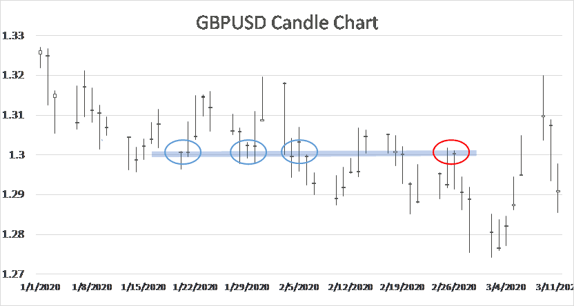 The change of polarity is not a foolproof rule and there are certainly exceptions. However, this rule can help investors quickly identify the new support and resistance in a changing market.
Moving average
Another popular technical analysis tool investors like to use is the moving average (MA) of a security. A moving average is the average price of a security for the past X number of days. For example, to calculate the 60-day moving average, you will average the price of a security for the past 60 days. With each new trading day, a new data point is added and an old data point discarded. As a result, the MA for a security changes slightly each day. This is also the reason behind the name “moving” average.
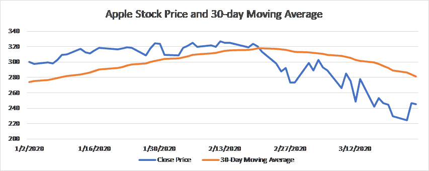 Moving average is widely used because it filters out the noise from day-to-day price actions. As you can see in the example above, the moving average line is smoother and less noisy. Additionally, MA also helps investors visualize the price trend of an investment. An upward moving average line shows investors that the price has upward momentum, while a downward MA can signal a bearish trend.
Golden cross and dead cross
You can also use two moving averages together to identify buy and sell signals. To do this, investors would look at a long-term MA and a short-term MA together. The crossover of these two lines has meaningful implications on the price of a security.
Golden cross – the first kind of crossover signals a potential buying opportunity for investors. When the short-term MA crosses the long-term MA from below, this forms a golden cross. A golden cross suggests that the security is gathering upward momentum and will likely rally in the future.Dead cross – on the other hand, a dead cross gives investors a sell signal. A dead cross happens when the short-term MA crosses the long-term MA from above. This could mean that investors should start reducing their positions.Bollinger bands
The last technical analysis concept you must know is Bollinger bands, a highly useful technical indicator. Bollinger bands not only can help investors predict the trend of volatility in the market but also signal opportunities to buy or sell a security.
This concept is based on the moving average calculation we learned earlier, although it is a bit more sophisticated. To build the Bollinger bands for a security, we first plot the moving average. Then we add two additional lines. The upper line is the moving average plus one standard deviation of the security. The lower band is the moving average minus one standard deviation. The upper line and the lower line together form a range around the moving average. These are the Bollinger bands. Building on top of our previous example, here is what the Bollinger bands look like for Apple in 2020.
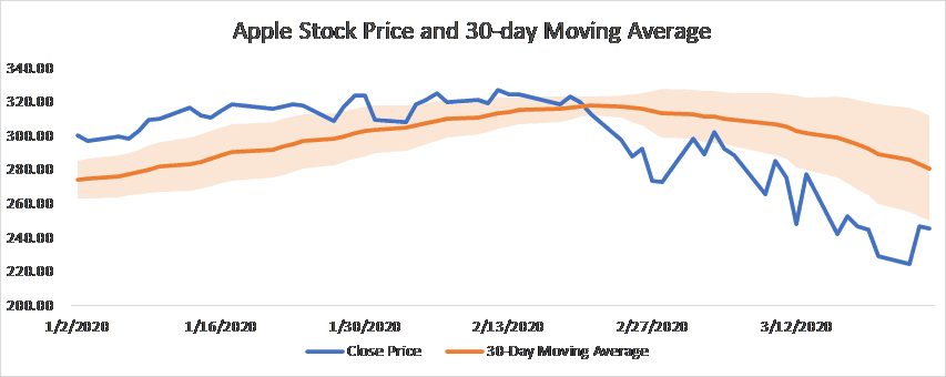 The distance between the bands shows how volatile the market is. Volatility is measured by the standard deviation. Because the Bollinger bands are constructed by adding or subtracting one standard deviation from the moving average, high volatility will cause the bands to grow wider apart. Conversely, during periods of low volatility, the two bands are closer to each other. As we can see from the graph, since the Coronavirus crash, the bands grew significantly farther apart, indicating a highly volatile market.
There are two major use of the Bollinger bands that you should know.
Volatility prediction – traders can use Bollinger bands to predict future market volatility. When the Bollinger bands are close to each other, you can expect higher volatility in the market. On the other hand, if the bands are wider apart, volatility could decrease in the future. For example, before the Coronavirus market crash, the Bollinger bands for Apple are extremely close to each other as you can see from the graph below. That was a clear signal that the stock would experience high volatility later.Trading signals – most of the time, the stock price will stay within the Bollinger bands. On rare occasions, the price will breach the bands. Such price actions often signal potential trading opportunities. For example, when the price breaches the upper band, it could mean that the security is overvalued and the price will decrease in the future. Conversely, when the price touches the lower band, there could be a buying opportunity in the market.Lastly, investors can construct different Bollinger bands by changing the number of standard deviations used to calculate the bands. Generally, the bands are one standard deviation away from the moving average. With more standard deviations, the price will more likely to stay within the bands. This also means that when the price breaches the bands, it is a more significant signal for changing market momentums.

Top-Tier Trusted Brokers
The table below contains links to 3rd party websites of our top partners from whom we receive compensation at no additional cost to you.
