


How to read candlestick chart: introduction to patterns and formations
Have you opened one of the analysis programs and you found yourself in a situation when you do not know what all those candles and formations mean? Then you came to the right place, take your seat lesson about candlestick is just about to start!
Learning how to read from a candlestick chart is one of the basic tasks in technical analysis no matter whether you trade forex, cryptocurrencies, binary options or any other financial instrument. The first thing which can pop up in your head when you look at a chart can be, what each candle means. There is a very easy answer to that: „price movement over a certain time period“.
When we work with charts we have to set a time frame, which is a time period that will each candle represent. So in case, we select the time frame 5 minutes, then one candle will speak for 5 minutes of moments on the market. Pretty logical, am I right? The time frame can be a 1 minute, 5 minutes, 30 minutes, 1 hour or even a year. So if you see on your chart 30 candles it means that you are looking at the last 150 minutes of price development.
Let's say you study a candlestick chart with 1hour time frame. In such case, the candle will reveal you to you the following information:
- Whether the price of a chosen asset increased or decreased during the hour in comparison to the hour before. Red candle = bullish market, Green candle = bearish market.
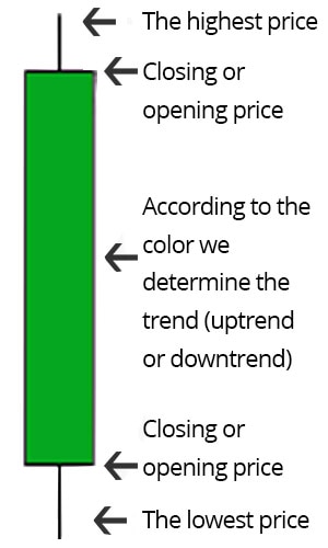
- Where the price was at the beginning of the hour 1) the bearish (red) candle has the opening price on the top of the candle 2) the bullish (green) candle has the opening price on the bottom of the candle)
- The lowest price to which the asset dropped during this hour (wick)
- The highest price which the asset reached during this hour (wick)
- At what price the candle (hour) closed (either on the bottom or the top of the candle)
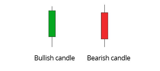
Bearish and bullish candles
When it comes to candlestick charts we can either have bullish candles or bearish candles. The bullish candle represents dominance of the sellers over the buyers and indicates a growing market (usually marked by a green candle). Its opponent is the bearish candle which advocates predominance of the buyers over the sellers, that indicates a declining market (usually identified by a red candle).
Forms and shapes of candles
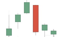
1) A long candle body indicates that the market is trending, by the colour of the candle we can distinguish whether the market is bullish or bearish.
- A) A long green body suggests that the buyers are in majority and that the price is increasing
- B) a long red body indicates that the sellers are in majority and that the price is decreasing
2) A short candle body advocates that the market is currently uncertain. The smaller the body of a candle is the harder and more uncertain it will be to predict who currently runs the market.
3) The third and last shape is a candle without a body, which looks just like a cross or a plus symbol. In such a situation, the trend is completely neutral. So neither the buyers nor the sellers are in majority.
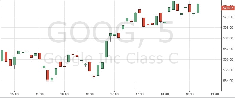
A simple example of a candlestick chart
On the picture below is Google stock displayed on a candlestick chart. Every candle on the graph stands for 5 minutes of moments on the market (M5). In total, we have 48 candles on the chart, which means we are looking at the past 240 minutes market activity. Green candles display price growth in contrast to red candles which represent price fall.
Candlestick Patterns - Doji formation
The introduction of candlestick forms and shapes is behind us. Now we will get into candlestick patterns which you will very often see when doing a technical analysis. Knowing the patterns which candlestick often form can significantly help you to predict future shapes of candles that will follow. The first candle, so-called doji candle can remind you a cross or a plus symbol. We have 2 main types of doji candles. The first one indicates market indecision. In such case, the upper and lower shadows (wicks) will have approximately the same length. Very often we can also see one doji candle immediately followed by another one. Here are a few examples of how such doji candles can look like.
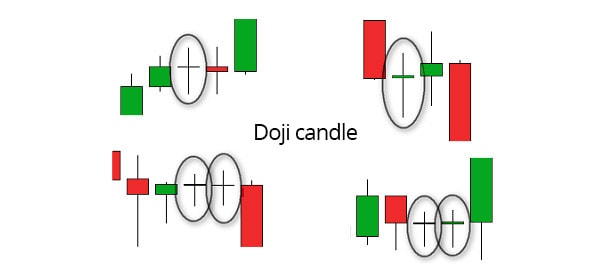
The buyers and the sellers are currently in a situation where both groups agreed upon a price, so the market is in a balance. The second type of doji candles is reversal doji candles which may look the following way.
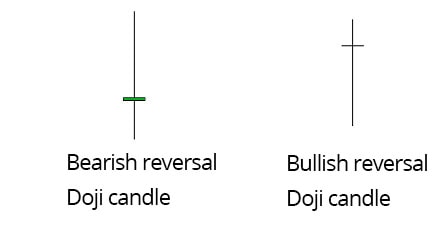
On a bullish reversal doji candle we can see that the sellers pushed the price very low, then the buyers took over again and pushed the price back up. It may be a signal that the bulls are about to interfere because the price tried to go down, but could not stay there and was subsequently pushed back upwards. Bearish reversal doji candles, on the other hand, indicates a situation when the buyers moved the price up and then the sellers came and took the price again back down.
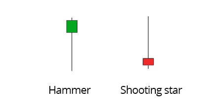
Inverted hammer and shooting star
These two candlestick patterns are not so different from reversal doji candles. Basically, the inverted hammer has a long lower shadow with a doji candle which is situated at the top. In contrast, the shooting star has a long upper shadow with a doji candle located at the bottom. They may look as follows:
Conclusion
There is a vast number of patterns which candlesticks can form, so don’t get caught off guard when you spot a pattern which you haven’t seen before. Each candlestick pattern is different and has different reliability. I advise using, for example, a free software for technical analysis like MT4, study the chart and familiarise yourself with common patterns.

Top-Tier Trusted Brokers
The table below contains links to 3rd party websites of our top partners from whom we receive compensation at no additional cost to you.
