


How to Read Charts When Trading Crypto
If you want to become a successful trader, you should learn to do technical analysis. This is a main ingredient in getting results regularly instead of on a luck basis. The most predominant tools in doing analysis are charts and graphs that follow market dynamics. Let’s take a look at the most essential crypto charts you might come across on top of different exchanges and see how to use them.
Line Price Chart
You always want to start with the basics, and Line Price Chart is a good fit for that. Traders use this chart to get an understanding of price dynamics over a period of time, and this dynamics is represented by a single continuous line. To draw the line, you need to take the price of the asset at the same time of a day over a number of days, and connect the dots. Lines on such a chart can be of two scale types: linear or logarithmic. With the line scale, everything is quite easy to understand. You plot the line with real values spaced equidistant from one another on the vertical y-axis.
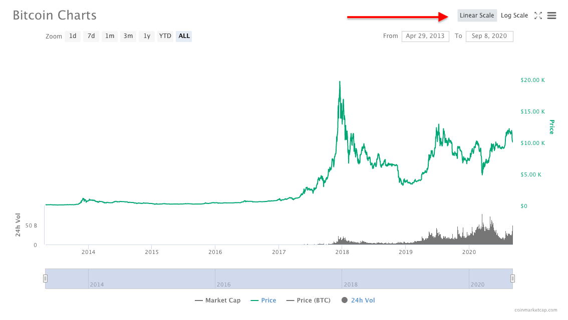
Linear scale, CoinMarketCap, BTC price over 6 years
See how prices, $5K, $10K, $15K, etc are spaced equidistant from one another on this CoinMarketCap, depicting Bitcoin price dynamics over the past 6 years. With the logarithmic scale, things get more interesting. A logarithmically scaled line displays numerical data over a wide range of values in a compact way - values are not the same distance apart on the log scale. Catch a glimpse!
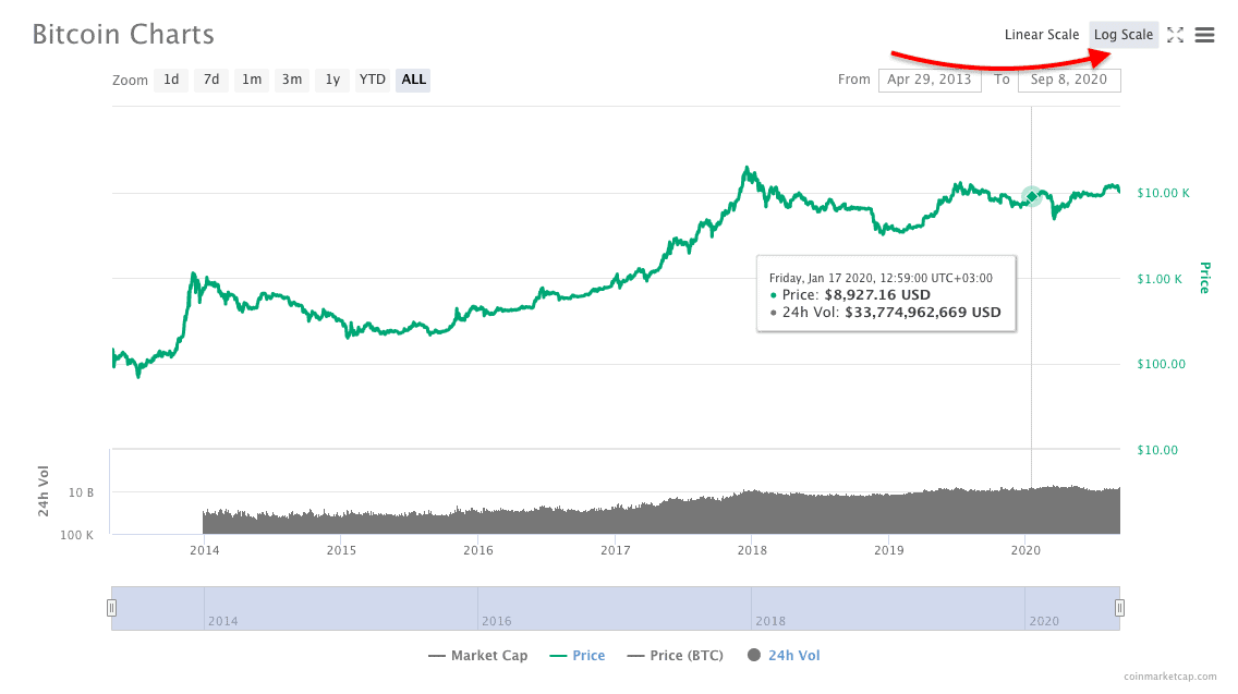
Log scale, CoinMarketCap, BTC price over 6 years
See how $5K, $10K, $15K, if they were plotted, wouldn’t be the same distance apart compared to the previous graph. How can we turn this difference to our advantage in trading? If two price changes are different in absolute value yet equal in percentage they will both be represented by the same vertical shift on the log scale, which is good for determining a trend. However, with a linear chart, you can better judge the speed of price change.
Candlestick Charts
One more representation of crypto price movements is candlestick charts. These charts are considered more informative than Line Charts since they not only show change in prices but also the dynamics over a specific period of time. For instance, the TradeSanta platform provides users with six time frame options from min. 6 hours to max. 1 week.
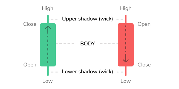
Take a look at two candles down below. If the candle is painted green, it means that the asset is bullish because its price has closed at a higher level than where it had opened. Say, BTC price has closed at $11,200 whereas it had opened at $11K.
Source: TradeSanta
If the candle is painted red, it means that the asset is bearish because its price has closed at a lower level than where it had opened. For example, BTC price has closed at $11K whereas it had opened $11,200. That being said, the wide part of the candlestick, the real body, tells investors about the price dynamics over a given period as well as the possible trend reversal.
Candlestick highs and lows (shadows) indicate the highest and lowest prices, respectively, over a specific period of time. These chart types gained popularity all over the world because they give us that much information.
 Source: TradingView
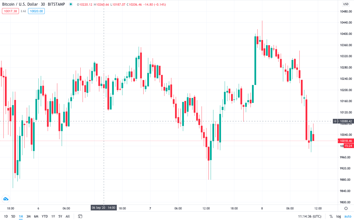
Here is what a typical candlestick chart looks like. However, there are more than 10 types of candlestick patterns traders can use to define trends.
Hammer Candlestick Pattern
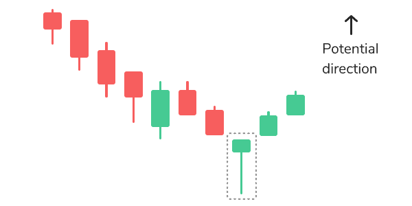
Source: TradeSanta.com
As you can see for yourself, this candle does look like a hammer and represents a short body with a long lower shadow. This pattern means that the distance between open and close was not very long, the close price was higher than the open price, with the asset trading significantly lower than its opening price. You can find this pattern at the bottom of the downward trend.
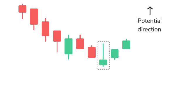
Source: TradeSanta.com
Inverse hammer also belongs to bullish patterns, and it implies that buyers are being in control of the crypto market.
Hanging Man

There is also another pattern that looks like a hammer except it can be found at the end of the upwards trend and warns that the prices might start falling. The Hanging Man candle is composed of a small real body and a long lower shadow. This candle means that the distance between close and open prices was short with the asset trading significantly lower than its opening price.
Shooting Star
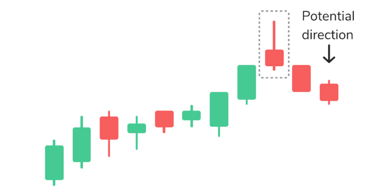
Source: TradeSanta.com
The shooting star is shaped the same way as the inverse hammer, but is formed in the upwards trend. It might indicate that the uptrend is over and it is time for a downtrend. Indeed, the highest price of the period was quite significant, but the distance between open and close quite short, with the close price lower than the open price.
Continuation Candlestick Patterns
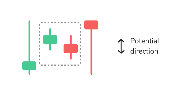
When there is no change in the cryptocurrency market and traders are quite indecisive about their next move, you can see so-called continuation candlestick patterns. Dojis form when the market’s open and close prices are equal, and its shape is similar to a cross, but with a bigger body.
Market Depth Chart
The depth chart represents the order book in real-time and gives you an idea of the Supply and Demand situation in the crypto market. The green side shows the total number of coins that have buy orders at the current price, while the red side shows the amount of cryptocurrency with sell orders at the current price.
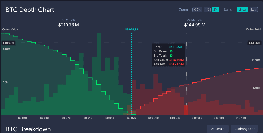
The centre, where two lines meet each other, represents the current market price. If you place the cursor on any point on the green or red line, you will see how much exactly you could buy or sell (vertical axis) at some specific price (horizontal axis).
Conclusion
If you want to be successful in your trading process, you need to learn how to read charts. Probably, this article covering the most basic charts and patterns will help you get a common understanding of trading principles and realize that reading charts is easier than you think.

Top-Tier Trusted Brokers
The table below contains links to 3rd party websites of our top partners from whom we receive compensation at no additional cost to you.